hi!app tech revamp
How can we enhance the entire hi!App design and user experience using in-house design system components within the existing backend and AEM constraints in 5 months?
Project under
Singtel
Duration
12 weeks
Singtel
Duration
12 weeks
My role
As a member of the hi!App squad, I enhanced the user experience for Singtel’s prepaid customers.
I led the platform limitations discovery, user experience improvement opportunities, features improvement prioritization, and design enhancement. I facilitated team collaboration, ensuring effective solutions and driving customer satisfaction and revenue growth.
What is hi!App revamp initiative?
Teach initiatives project aims to improve hi!App with a new React Native front-end codebase
Maintain a unified codebase for Android and iOS (efficiency)
Achieve faster development and iteration cycles (efficiency)
Optimize app performance and security (performance)
What are the opportunities identified alongside the revamp?
Enhance the design and experience to be more intuitive and user-friendly. Integrating an in-house design system for consistent branding and streamlined development
Improve overall design and user experience (user satisfaction)
Enhance tracking and analytics capabilities (data-driven decision-making)
How did I start the project?

01
Evaluate current state
The app initially lacked user testing, real user feedback, and performance tracking, which hindered the identification of usability issues and optimization opportunities. Additionally, frequent designer changes and inconsistent handovers resulted in no master flow for reference.
I started this project by consolidating screens and features to review flows and errors with POs/developers and created a comprehensive reference file. This allowed the team to document assumptions and feedback on app pain points that contribute to a poor user experience.
Existing log-in flow
The login page has poorly organized feature entry points, which are combined with the login function.
This potentially overwhelms users with too many options, making it difficult to focus on the primary task. As a result, users may accidentally select the wrong path, leading to frustration.
The login page has poorly organized feature entry points, which are combined with the login function.
This potentially overwhelms users with too many options, making it difficult to focus on the primary task. As a result, users may accidentally select the wrong path, leading to frustration.

Key screens
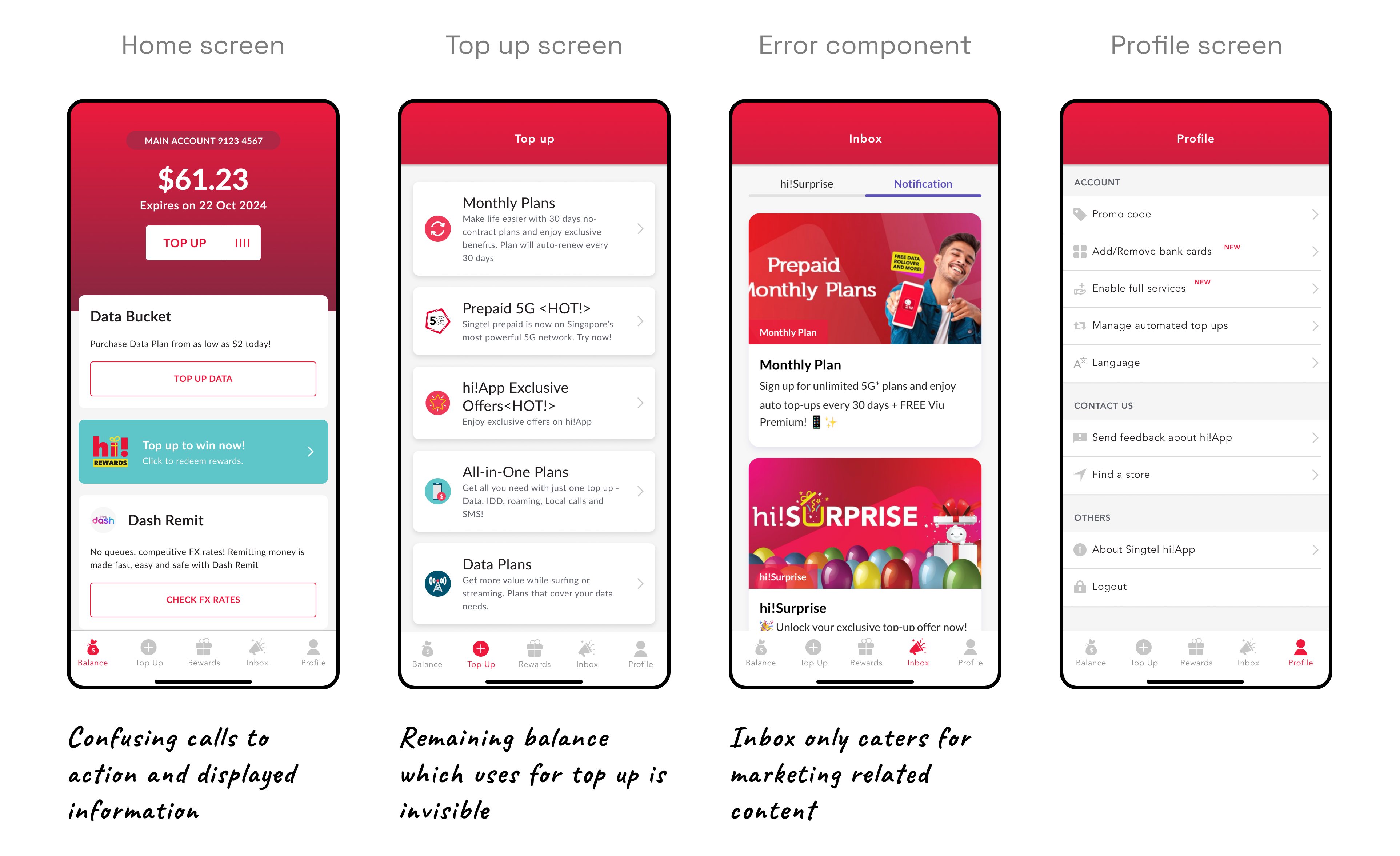
The outdated design components require extra time and resources to enhance, slowing down the development process and hindering the team’s ability to scale features to meet user needs.
Additionally, the unorganized content on the key screen, coupled with limited components, results in an unintuitive user experience.
Key revenue-driven flow
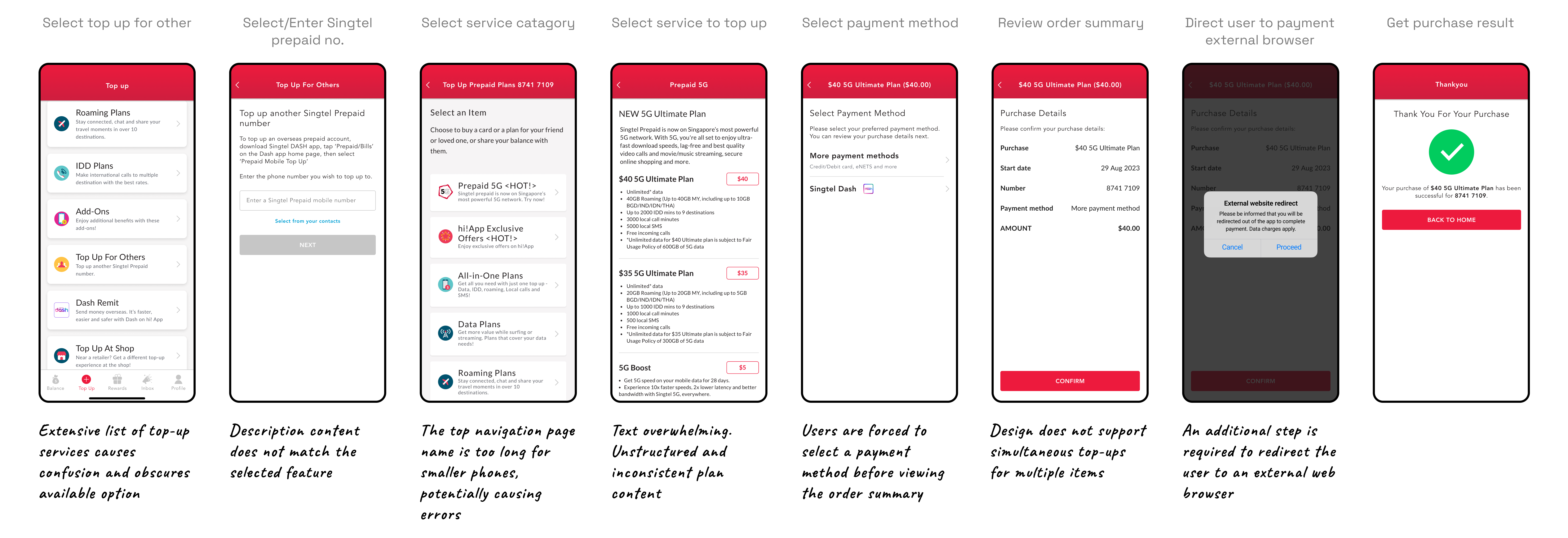
The top-up flow is set for improvement alongside the tech migration. Our analysis reveals that the current back-and-forth journey and unstructured content do not align with the user's mental model for topping up services.
02
The challenge
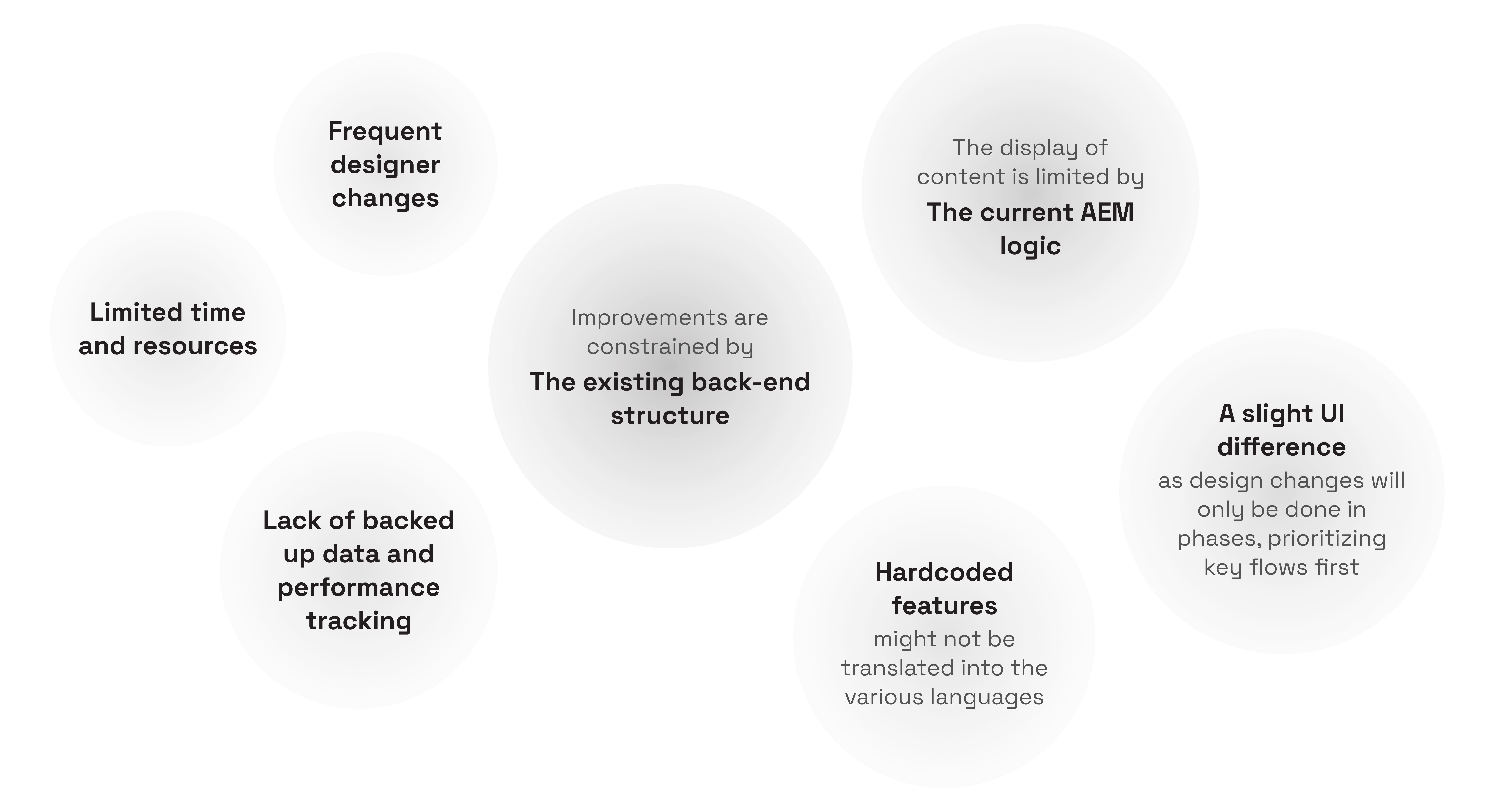
In addition to the unorganized working process and unintuitive user journey that was mentioned earlier, the areas of enhancement are also restricted by the current AEM logic and existing back-end structure.
Key areas for improvement
“ We’re prioritizing a revamp of the top-up flow design due to its critical pain points, revenue impact, and potential for quick design improvements ”
The remaining screens will be updated with 1-to-1 design translations using the new design system and branding due to the project scope, timeline, and deliverables.
03
Design system collaboration
Design system collaboration
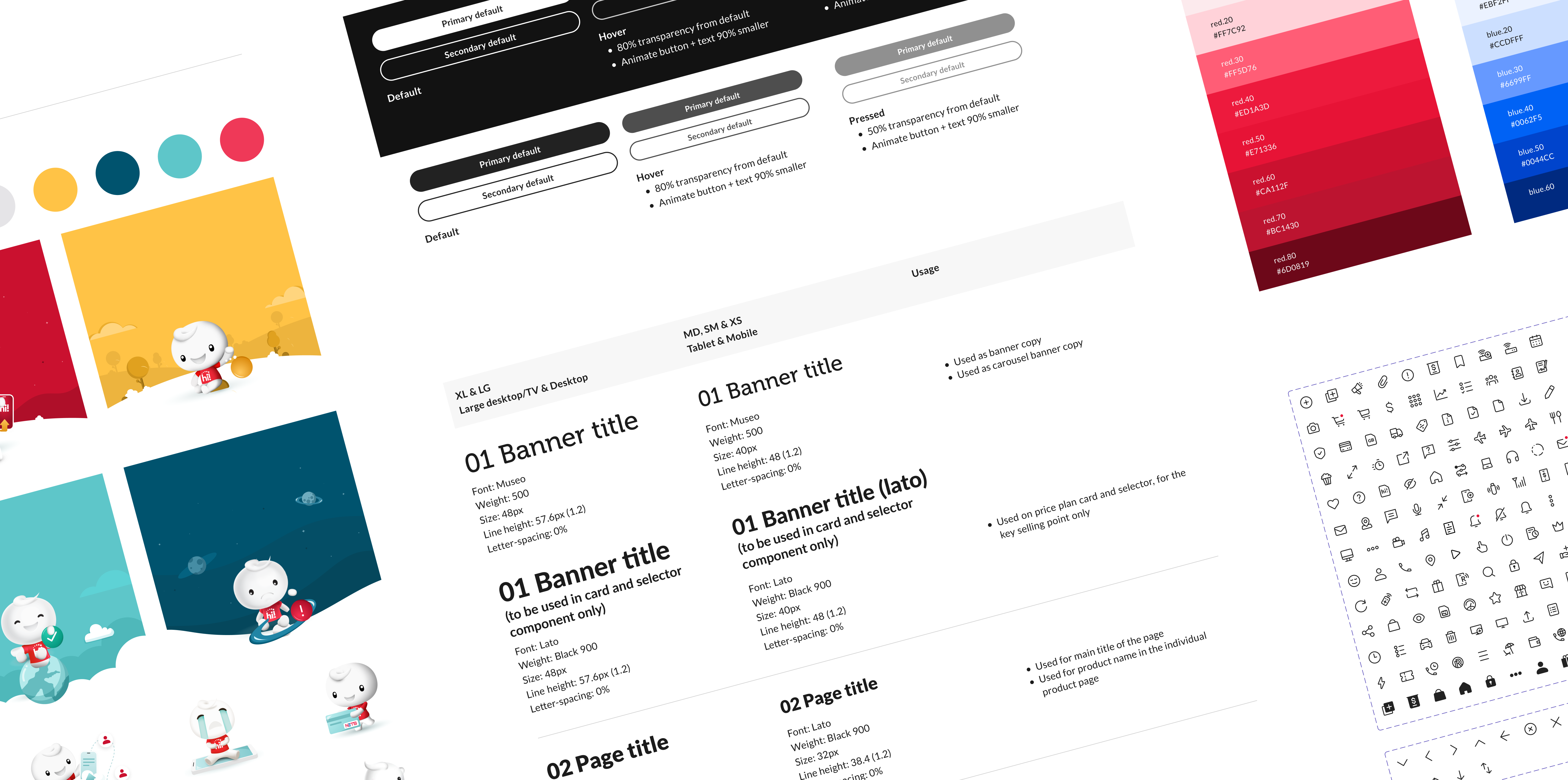
Singtel's in-house design system is used across Singtel.com, My Singtel App, and hi!App. However, stakeholders have raised concerns that the hi!App branding is lost due to its wireframe-like appearance, characterized by black buttons and blue text links.
“ To address this, I integrate hi!App brand colors and leverage the hi!Buddy mascot to enhance visual interpretation ”
This not only strengthens the brand image but also improves content understanding, usability, and emotional appeal.

04
UI design
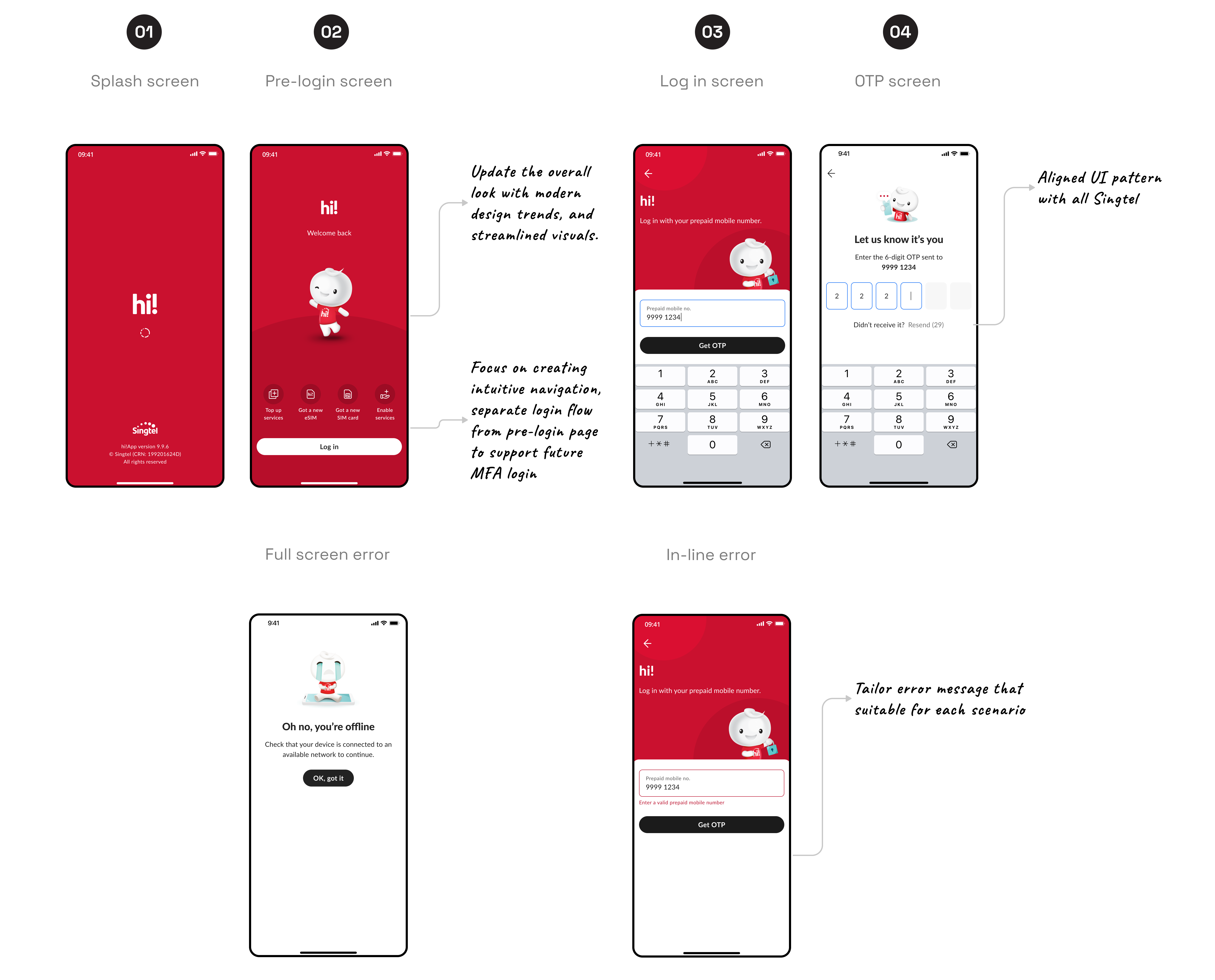
Login flow
I updated the design with modern aesthetics, focusing on the brand mascot and colors, and streamlined the visuals for intuitive navigation. Additionally, I separated the login flow from the pre-login screen to support future SDK login functionality.
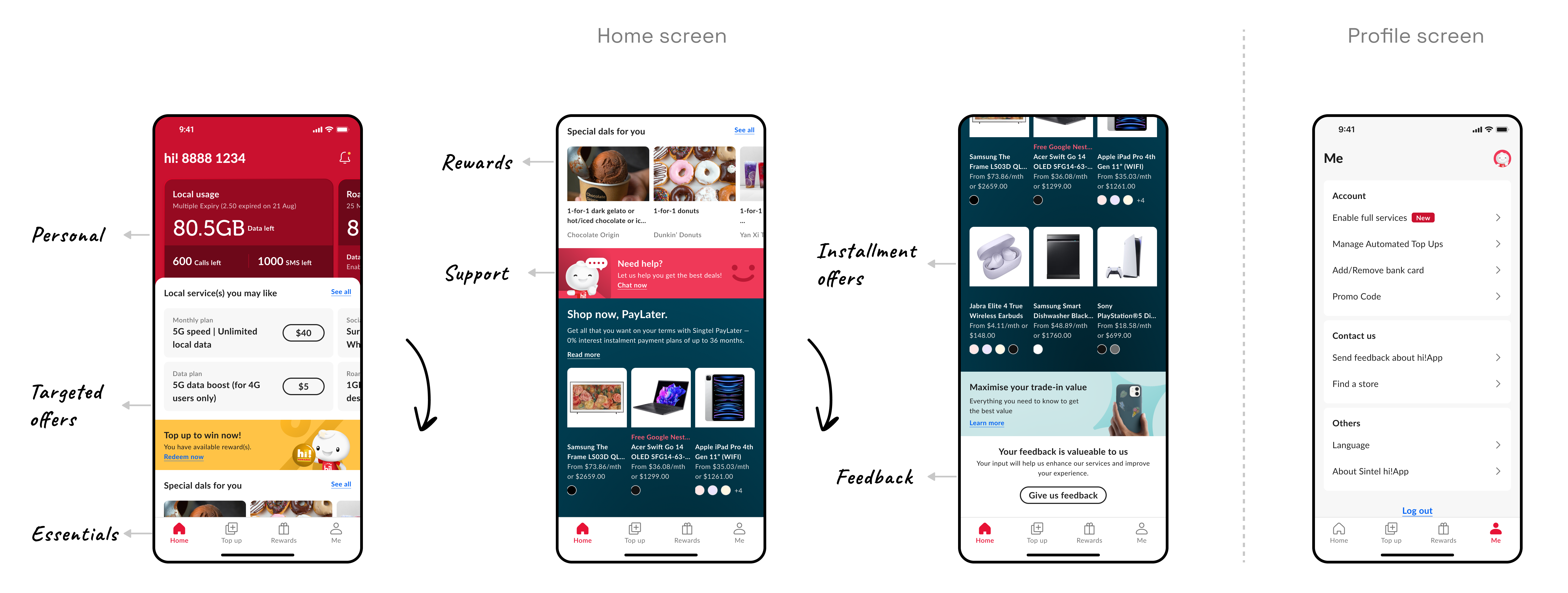
The homepage is prime real estate that every stakeholder wants to utilize according to their KPIs and roadmaps. I proposed a template that allows us to toggle visibility and change the ordering of elements which can be measured from CTRs (User intent) and revenue contribution (Business goal).
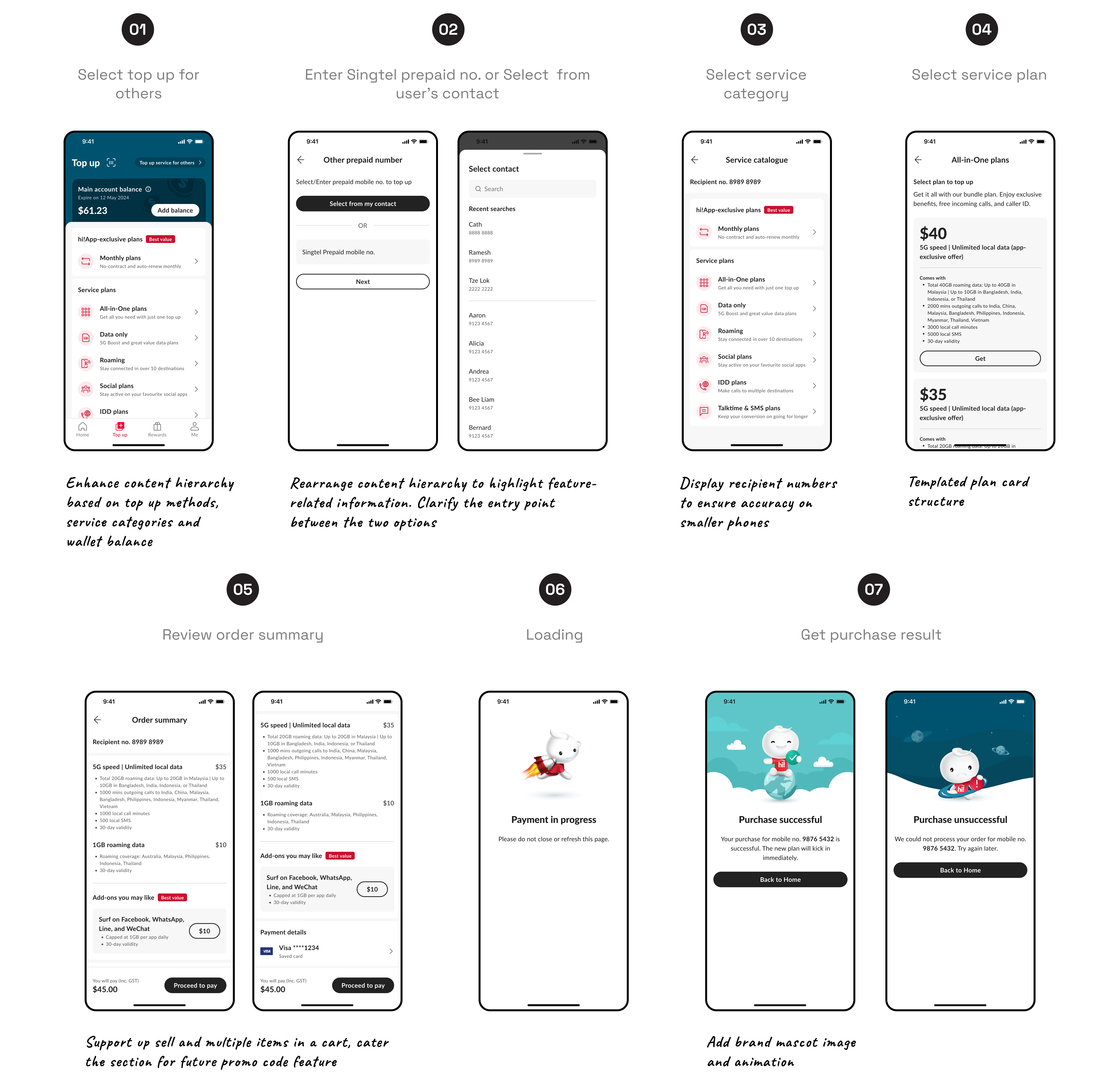
Top up flow
Since we cannot change the backend system at this stage, we decided to enhance content hierarchy and visibility to better align with the user's mental model. This will reduce confusion and ensure relevance and usefulness.
Additionally, we improved the design to support future feature enhancements, such as multiple items in the cart and dedicated space for promo codes.
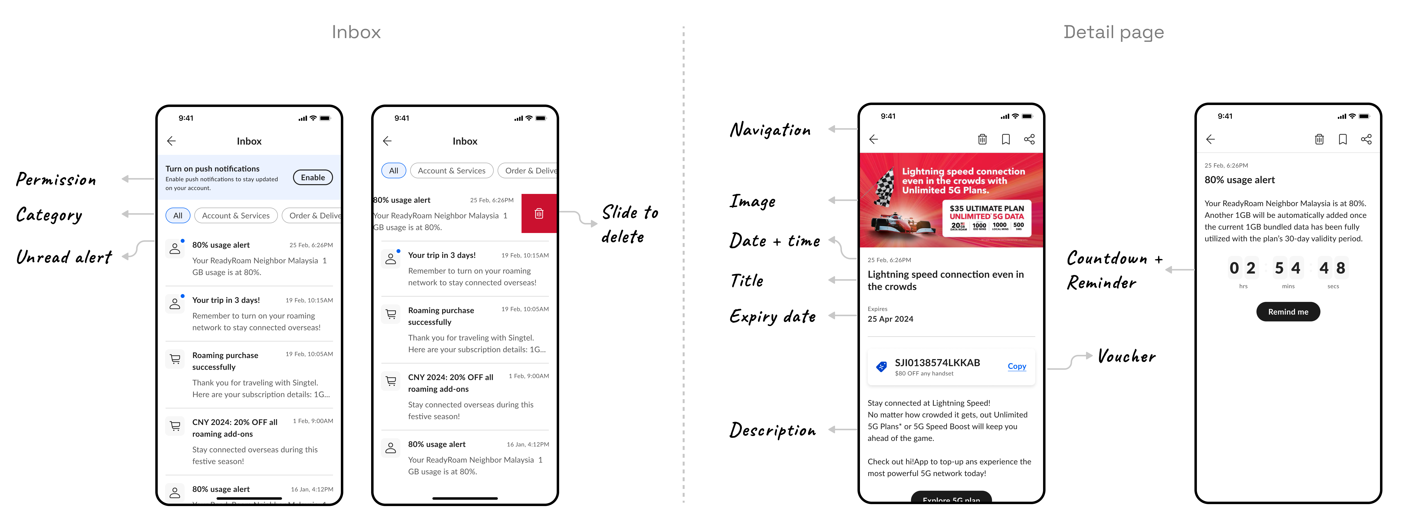
Inbox screens
I partnered with another designer from the My Singtel app to develop a new inbox feature template for use across all Singtel products.

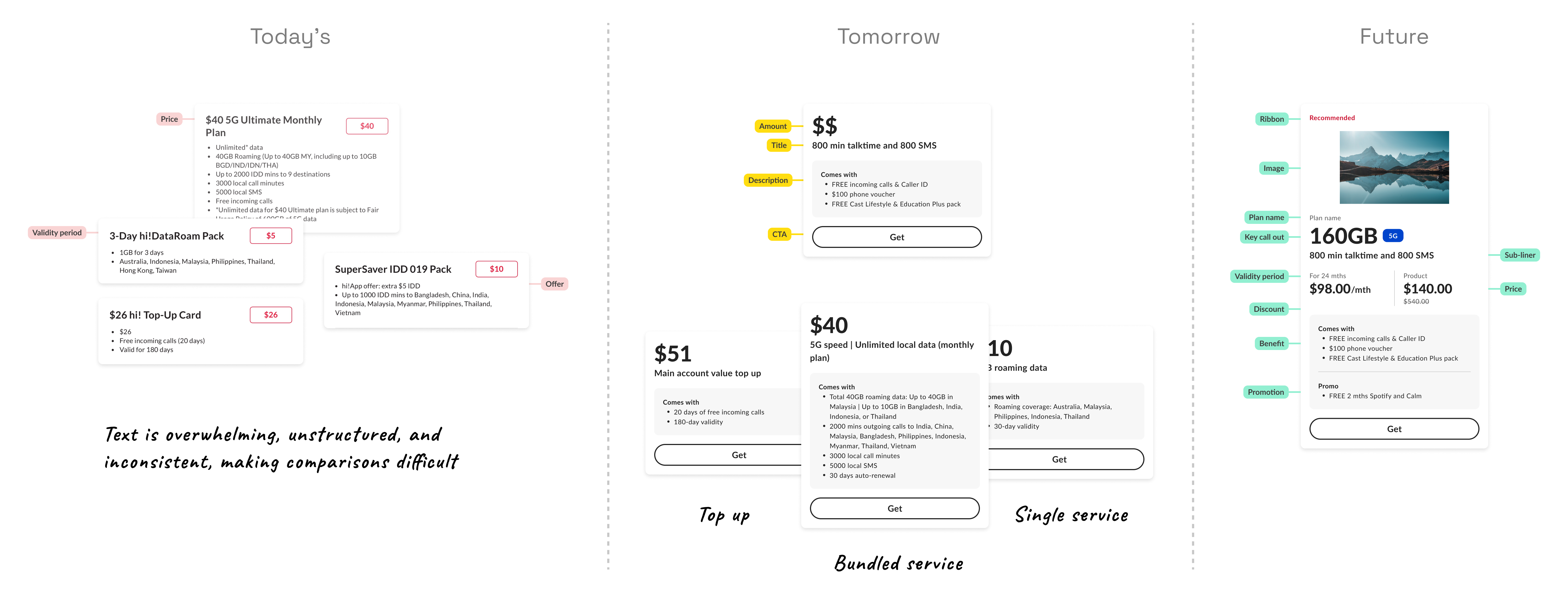
Price plan card template
Due to misaligned design systems and AEM content limitations, we couldn't display content or use the plan card component from the design system. I collaborated with the design system squad and marketing team to propose an interim design that matches with current AEM logic.
System template
I created a reusable template for error and maintenance scenarios applicable to all contents.

Stakeholder alignment
To work in a cross-functional team, I facilitate collaboration between other squad designers, developers, design system teams, and business stakeholders to ensure seamless integration and alignment.
05
Moderated usability testing
I collaborated with the research team to conduct Semi-structured interviews to evaluate the usability of the redesigned UI. For this evaluation, we will be considering the needs of users who are foreigners residing and working in Singapore

“ How do we help users improve task completion speed and ease while assessing intuitiveness and user-friendliness? ”
Through user research, we also evaluate how well the new design aligns with the brand’s identity, gather user insights, and identify any design flaws that may negatively impact the user experience.
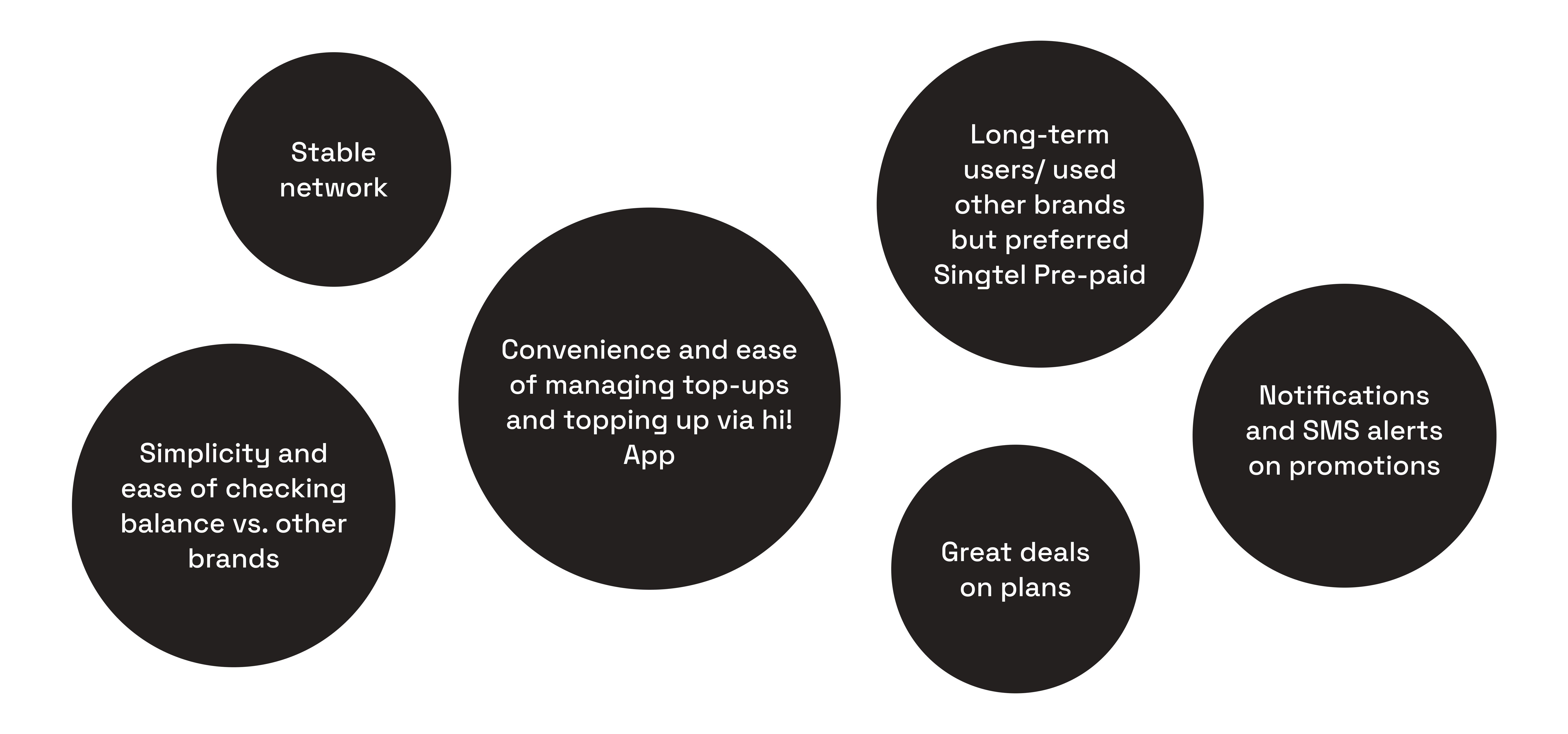
6 out of 7
Overall perception rating their experience of using the app.
Key features used:
- Account management
- Top up and purchase plans(e.g., Data, IDD)
- Check Account balance
- Exploring plans

Login
Most participants liked the idea of having frequently used items available before logging in, particularly the Top-up feature.
However, there were some items that participants wanted to remove and others they wished to add.
Most participants liked the idea of having frequently used items available before logging in, particularly the Top-up feature.
However, there were some items that participants wanted to remove and others they wished to add.

Home screen
Clear Visual Hierarchy, and the use of distinct sections for different features (e.g., personal usage, offers, rewards, support) help in navigating the app.
However, the heavy focus on promotions and offers might detract from the primary utility features that users may be looking for.
Clear Visual Hierarchy, and the use of distinct sections for different features (e.g., personal usage, offers, rewards, support) help in navigating the app.
However, the heavy focus on promotions and offers might detract from the primary utility features that users may be looking for.

Top up screen & Categories
The recategorized plans helped participants discover plans more easily.
For business consideration, some participants also expected monthly plans to be deducted from their main account balance.
The recategorized plans helped participants discover plans more easily.
For business consideration, some participants also expected monthly plans to be deducted from their main account balance.

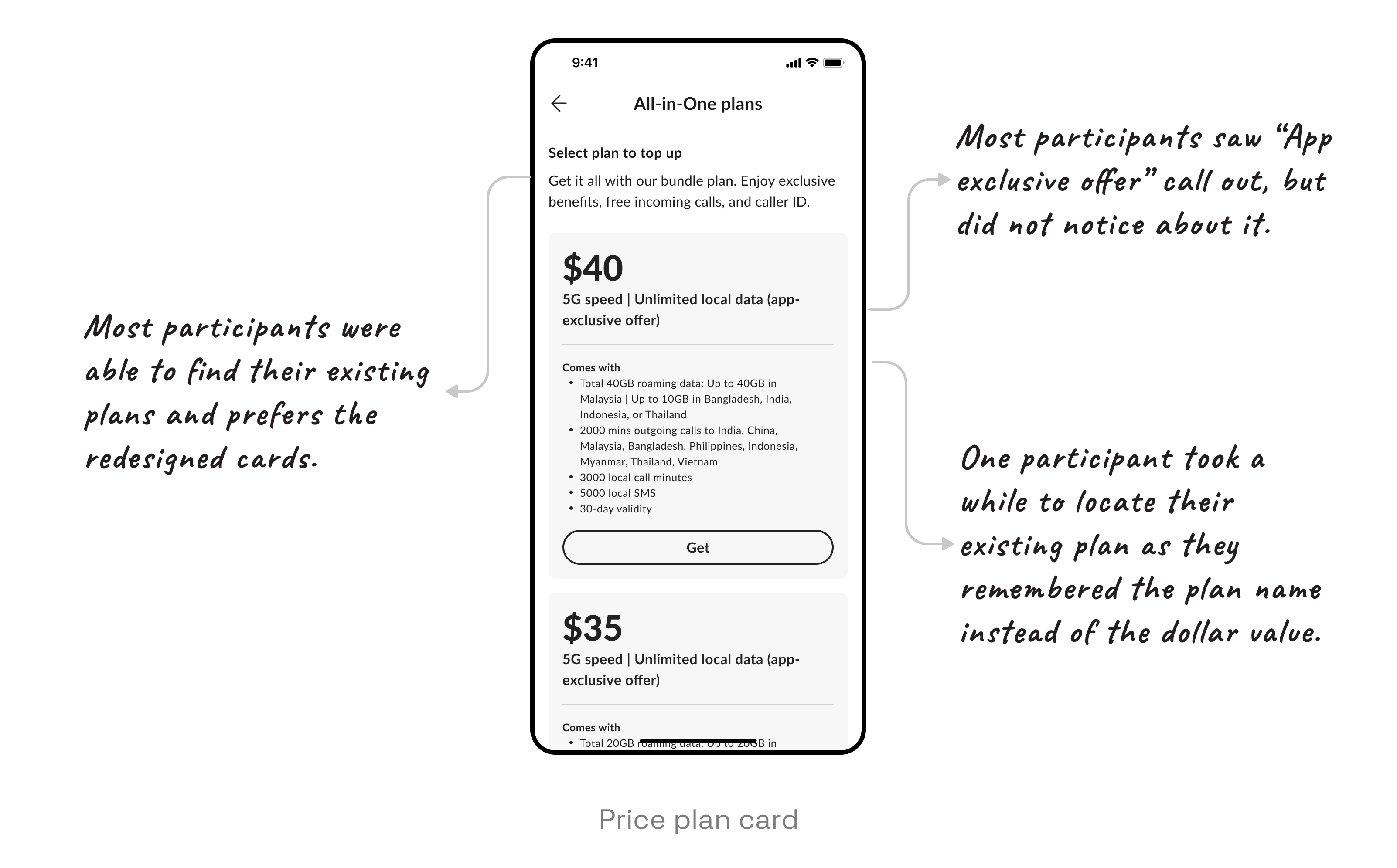
Price plan card
The plan card details were clear, as participants were able to locate the plans on their first attempt.
However, the absence of plan names may impact existing users who are more familiar with the names than the dollar values. Additionally, hi!App exclusive offers should be clearly highlighted.
The plan card details were clear, as participants were able to locate the plans on their first attempt.
However, the absence of plan names may impact existing users who are more familiar with the names than the dollar values. Additionally, hi!App exclusive offers should be clearly highlighted.
06
Next steps
UI design improvement: Once we receive the official analysis of the testing results from the research team, the PO and I will prioritize the critical items that need improvement in this production round. We will then plan the roadmap for items to be addressed after the launch.

