k plus shop
PROJECT UNDER
IC Web
CLIENT
Kasikorn Bank

BACKGROUND
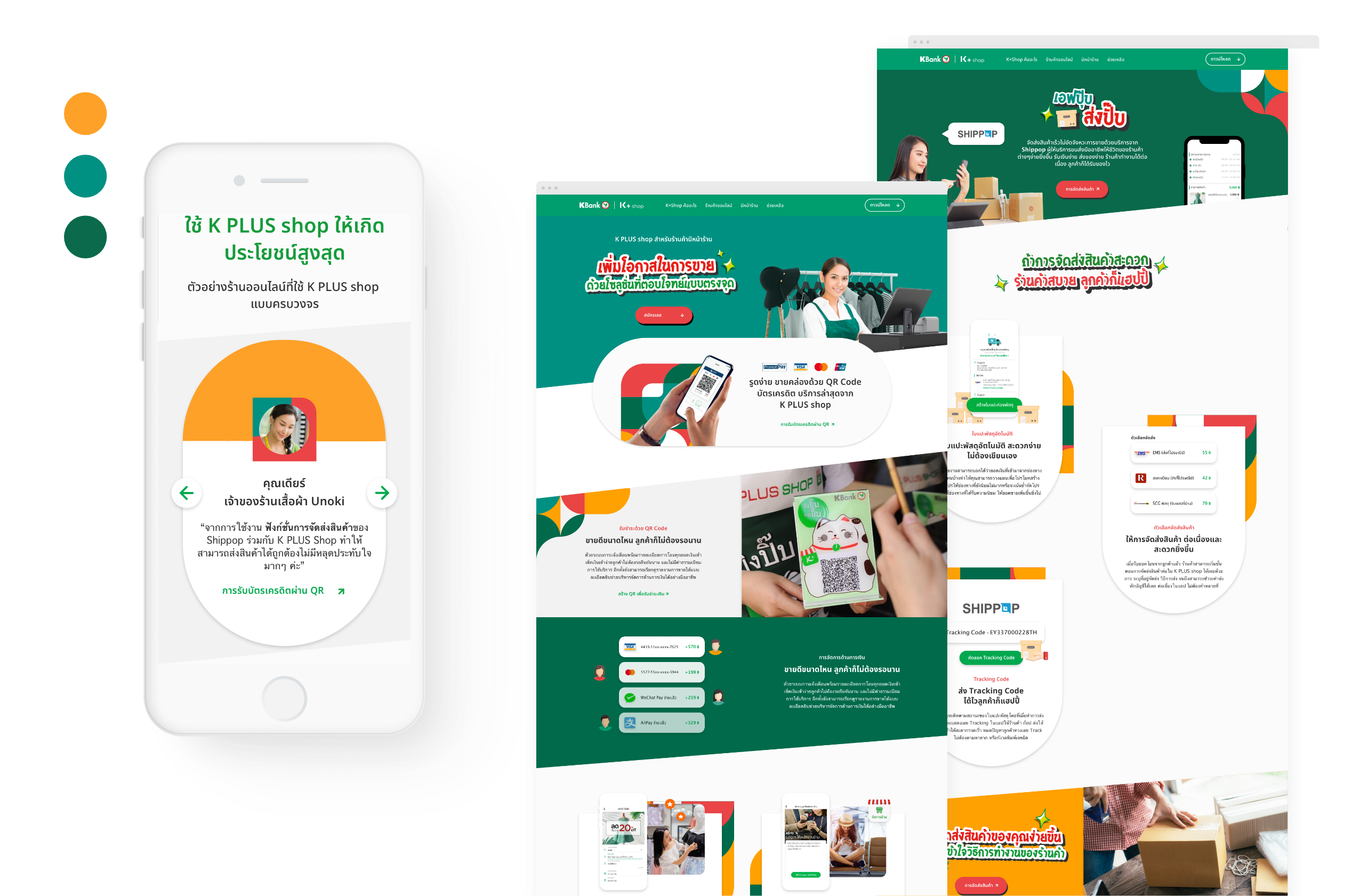
K PLUS shop is a shop management application that will help sellers manage payment in a more cashless way. Functions and features are designed to help the easier management no matter where you are. It is one of the products under Kasikorn bank. They aimed to present their application through the introduction website. In addition, other significant objectives were to enhance customer engagement and illustrate the benefits of increasing income from using the K PLUS shop application.
We were asked to create an attractive website that could refresh the brand image to fascinate their target audience who are both offline and online sellers.
We were asked to create an attractive website that could refresh the brand image to fascinate their target audience who are both offline and online sellers.
UNDERSTANDING USER TARGET
We started the design process by researching their competitors and what is out there in the market. We discovered user insights by doing the survey and interviewing customers in order to define design direction, UI style guide, tone of voice, and also information architecture of contents.
![]()
![]()
A primary persona is a straightforward person who doesn’t like taking much time to understand complicated information. They have many things to deal with in their daily tasks. That’s why we use a benefit-driven narrative approach to be our solution for capturing the audience’s attention.


A primary persona is a straightforward person who doesn’t like taking much time to understand complicated information. They have many things to deal with in their daily tasks. That’s why we use a benefit-driven narrative approach to be our solution for capturing the audience’s attention.
DESIGN DECISION
According to the research, we found that both offline and online sellers commonly use the Line application to be the main channel to communicate with customers and their staff. They preferred to use in-app stickers more than typing features. Thus, we decided to add these gimmicks in our design direction with the belief to use what users are familiar, with would directly attract their interest.
![]()
![]()
![]()


